Broadcast stream
application
application
Redisign concept
About App
It is the live streaming video community for creating and finding user-generated content.
Our purpose

Improve users experience
Make user interaction with app more clear and evident. To reduce misunderstanding and wrong UX patterns.

Improve Information Architecture
Redesign the content structure and make navigation through app more intuitive and predictable.

Create unique UI and Visual Style
Create an uniform style with unique elements that improve interaction and general impressions
BASICS
Informational Architecture
Information Architecture is the way of arranging content. The reason why your users may be confused or overwhelmed (most of the time) is not because of the visual design but the disorganized Information. The right structure and navigation system allows a user to achieve their objectives and feel comfortable while using the app.
Currently we have 5 options in the bottom navigation bar and 4 options in top tab bar on home screen.
Currently we have 5 options in the bottom navigation bar and 4 options in top tab bar on home screen.
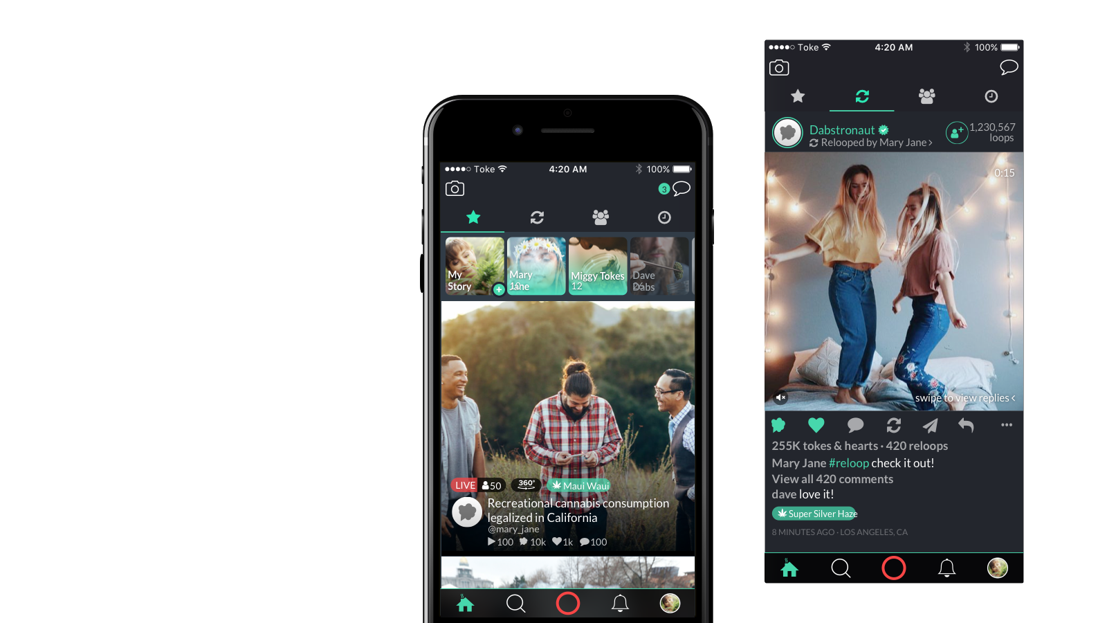
* Currently design
Users view nine icons without names when he launches the app. New users and users who don't use the app for sometime can be confused to view so many options.
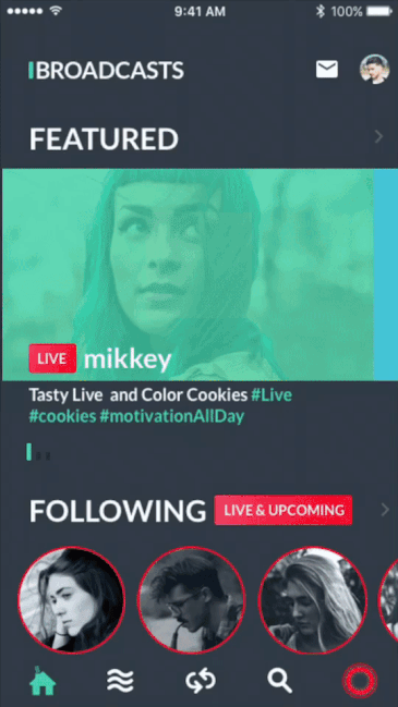
Broadcasts
It has Main Feed and 4 sections sections. Splitting content in such a way will help users to view only interesting content but with the opportunity to view more.
Further, we've added the section which includes a list of live and scheduled broadcasts. This is important section doesn't allow users to miss Following Broadcasts especially when push notifications are turned off.
We used different colors to make emphasis and draw attention on key sections. Our intention is to create something simple and clean so that people's content are front and center in the app.
Archived Broadcast is presented in the main feed.
interactions
Main Features
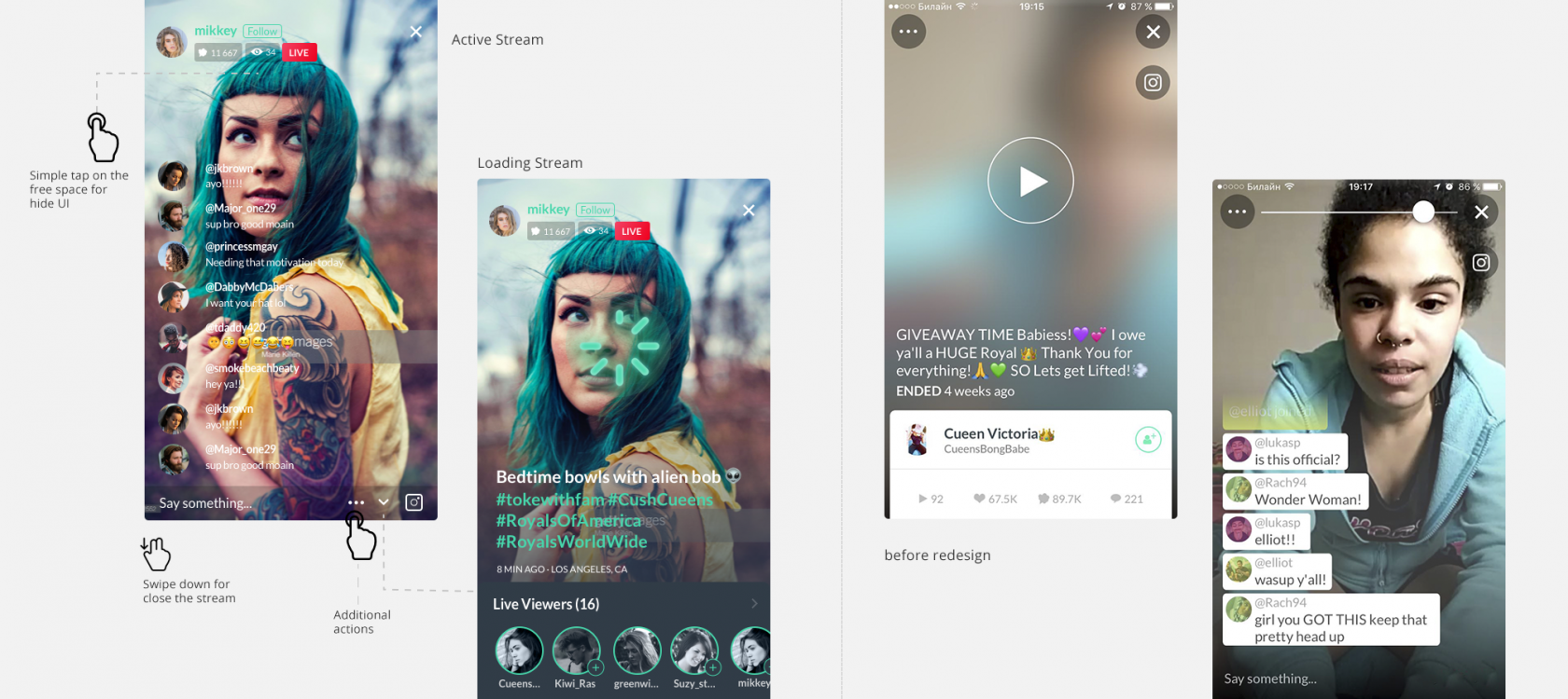
Stream View
The viewing Live Braodcast stream in the main features of our app. Most of the interactions concentrates here. We made user minitoring and survey for define the main problems. Our user are devided in two type: user viewing stream and users that make this stream.
The old version of this functionality has many issues. One of them it's big elements that interfere with viewing stream. So the comment bubbles fill the much screen place, and viewers can't see the caster. Another way, the caster can't see the comments and have to hold the phone close itself. We suggest making a different display options for viewers and casters. Comments for caster we left unchanged but slightly increased the font size.
Also, we redesigned the other elements, their placement, and interaction with it. On the top of the screen, we put information about user and likes/views counters. Like counters and View counters provide quick information about popularity and success of current Broadcast and motivates viewer to touch for more likes.
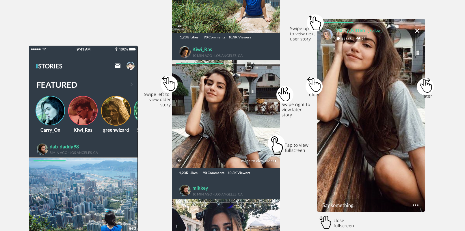
Archived stream
When the stream ends it becomes archival. The user that views this stream have a different purpose than the user in a live stream.
Some of these issues - how to see the most interesting moments on the stream, how to make the quick view of the stream.
And that's why If we look at the archived stream now we can not only see information about viewers but also all comments. For this user have to swipe up on details view and comments screen will open in a new screen. Also we added new features in this view - Broadcast activity. This schedule shows us the time when users were more active. Tap on the schedule, and we'll move to a comments at this time. Tap on the comment to run to video from this place.
Stories Section
Currently after opening the application, our users are met with two prime features competing for their attention — should they scroll through the stories or surf through the feed? Both options are very content-saturated, and can almost feel like an endless pit of scrolling. According to research on the paradox of choice, more choices can actually lead to decision fatigue, less happiness, and guilt or fear of missing out (FOMO).
The evolution of the community has been inspiring, and we hope that we've captured some of the life, creativity, and optimism people bring to App every day. Our hope is that people will see this app as a new creative spark — something to have fun with and make their own.
© All Rights Reserved. Alla Semenchukova
semenchukovaav@gmail.com
semenchukovaav@gmail.com
